"Rosct" Scanner
Enhancing the User Interface and User Experience of Industrial Computed Tomography Scanner Software

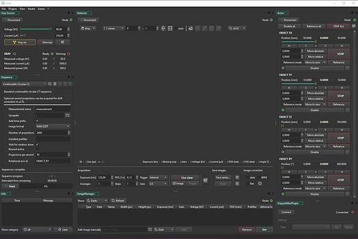
Old user interface of Rosct
Rosct is a software system used to operate an industrial CT scanner. It allows users to control the scanning process, set basic scan options, and view the scan results. The software serves as the main connection between the user and the scanning machine, making it possible to run X-ray scans and inspect objects without damaging them.
Role: UX Researcher & Designer
Tools: Figma
Timeline: 6 months
The Challenge
The existing ROSCT software was difficult for new users. The interface was crowded, navigation was unclear, and beginners did not receive enough help to understand how the system works.
My Process
I applied a human-centered design process, following the Double Diamond model: Discover → Define → Develop → Design → Deliver
Discover
The Discover phase was all about building a deep understanding of the real user needs, context, and pain points of the Rosct industrial CT scanner software. Because this is a highly technical tool used by different types of users, I combined qualitative user research with comparative analysis of similar software.
Research Methods
User Interviews
I conducted one-on-one, semi-structured interviews with two main user groups:
-
Expert users (experienced researchers and CT operators)
-
Beginner users (students, trainees, or new hires)
This ensured I captured the full range of workflows, frustrations, and goals. The interviews were structured around key questions like:
-
“Describe your daily experience using the Rosct software.”
-
“Which parts of the UI help you the most?”
-
“What features confuse or slow you down?”
-
“What would make it easier for you to do your tasks?”
This method allowed me to gather rich qualitative data and dig deeper with follow-up questions.
Competitive Analysis
I conducted a competitive analysis by studying four comparable CT software solutions:
-
datos|X acq
-
Volex6
-
Volex10
-
WinWerth
-
Lumafield
I spoke with experienced users who had used these tools to find:
Which usability patterns worked well (like fixed toolbars or guided steps)
Which design pitfalls to avoid (like cluttered panels, outdated visuals, or unclear icons)
I summarized each tool’s strengths and weaknesses, mapping them to Rosct’s context to inspire improvements.

Competitive analysis table
Define
In the Define phase, I analyzed the results of the user research to understand the main user problems and needs. I created user personas to represent different types of users and their goals, and I used affinity mapping to organize and group the research insights. This helped me identify common usability issues and define clear design goals for the Rosct software redesign.
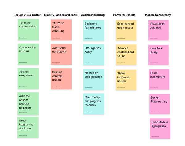
Affinity Mapping
Personas for distinct user groups :


Personas for Beginner Users
Personas for Expert Users
Based on user research, I found that Rosct software is used by both beginner and expert users. Beginner users struggled with the complex interface, while expert users needed full control over advanced settings. Therefore, we decided to design two versions of the software: a simple, guided version for beginners and an advanced version for expert users.
Develop
In the Develop phase, I used the research findings to create clear and practical designs. The goal was to turn user needs into solutions that are easy to understand and implement. I created a simple user flow to show step by step how users complete their tasks.
Assistant Mode Flow

Design
In the Design phase of my master’s thesis, I turned the research results into real design solutions. Based on user interviews, affinity mapping, and personas, I focused on making the software easier for both beginner and experienced users.
I created wireframes and then detailed designs to show how the interface should look and work. I also built interactive prototypes so the system could be tested.
For beginner users, the software automatically sets technical parameters like magnification, spectrum, and exposure time. This makes the system less confusing and easier to use.
During the design process, I created five low-fidelity and five high-fidelity iterations. For this portfolio, I selected two low-fidelity and one high-fidelity prototypes that best demonstrate the key design decisions and improvements.
Wireframe of First Iteration for Assistant Mode
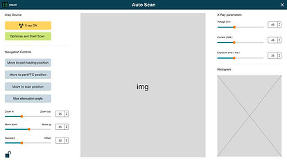
I separated Easy Mode and Expert Mode to reduce complexity for beginners. I introduced a guided Auto Scan flow and replaced technical terms with simple actions to make positioning easier.

Wireframe for the first screen of Assistant Mode

Wireframe for the Manual Scan Screen of Assistant Mode

Wireframe for the Auto Scan Screen of Assistant Mode

Wireframe of Manual Scanning progress

Wireframe of Scanned successfully
Wireframe of Second Iteration for Assistant Mode
In the second iteration, I merged the Manual and Auto Scan modes after identifying overlapping functionality. I made the Auto Scan steps transparent by showing key parameters such as magnification, spectrum, and exposure time, which helped users understand the process without increasing complexity. By improving button placement, visual hierarchy, and adding clear feedback, the interface became more intuitive and confidence-building, especially for beginner users.

First Screen of Auto Scan

Wireframe of Auto Scan Screen

Wireframe of loading parameters screen

Wireframe of the Scanning process

Wireframe of Scanned Successfully
Wireframe of High Fidelity Wireframes for Assistant Mode
High-fidelity wireframes replaced low-fidelity ones. “Maximum Attenuation Angle” was moved for easier access, and the three-step intro was removed to show all scan parameters directly. A single active “Configure Scan” button guides the user, simplifying interaction and improving usability.

First high-fidelity wireframe of third iteration

Auto Scan in progress: Magnification step

Auto Scan in progress: Exposure time step

Loading for saving the scan

Scanning progress
High Fidelity of Auto Scan settings interface

Auto Scan in progress: Spectrum step
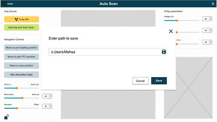
File path entry for saving the scan

Changes saved successfully

Changes saved successfully
Wireframe for Expert Mode
In the updated Expert version of the Rosct software, I focused on improving clarity and efficiency without removing advanced functionality. I reorganized toolbars by grouping related tools within each section and moved rarely used features into settings or advanced switches to reduce visual clutter.
Frequently used controls, such as exposure and averaging, were made more prominent, while secondary tools were hidden or accessed through dropdowns and icons. Scanning and image tools were repositioned closer to the image based on user feedback, and progress indicators were added to provide clear, real-time feedback during scan sequences. These changes resulted in a more focused, consistent, and professional interface for expert users.

Wireframe of rosct (Expert Version)
Deliver
In the Deliver phase, I finalized the high-fidelity designs and prepared them for implementation. I delivered interactive prototypes, final UI screens, and clear design specifications to ensure a smooth handover to development. All feedback from testing and iterations was reflected, resulting in a consistent, implementation-ready design.
Prototype of Assisstant Mode


Prototype of Expert Mode
Prototype of Image History dialog
When the user right-click and all the advance feutures pops up
Component and Style guide for Assisstant Mode


Reflection
Looking Forward
As a next step, the Rosct interface can be improved by keeping all user modes consistent. To match the Assistant and Expert modes, a dark mode should be added to the Assistant Mode.
It would also be helpful to create a design system for the Expert Mode to keep complex features consistent and easier to manage.
These changes would need more testing and user feedback. Based on the results, the design can be improved step by step to better support real industrial CT workflows.